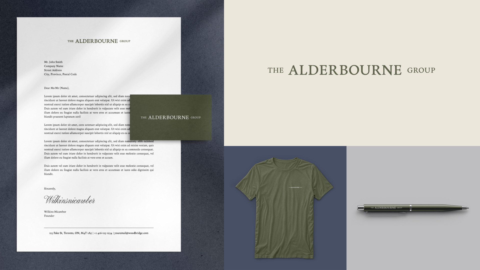
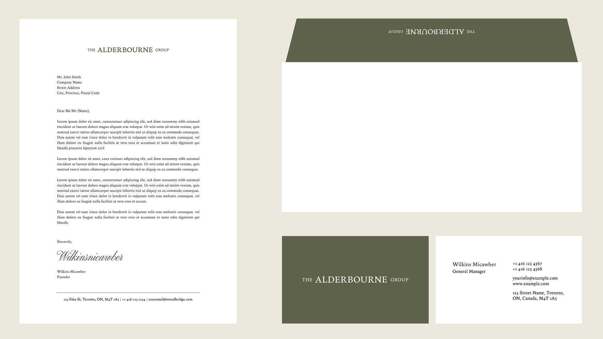
The Alderbourne Group
Project Type Logo Design & Colour Guidelines
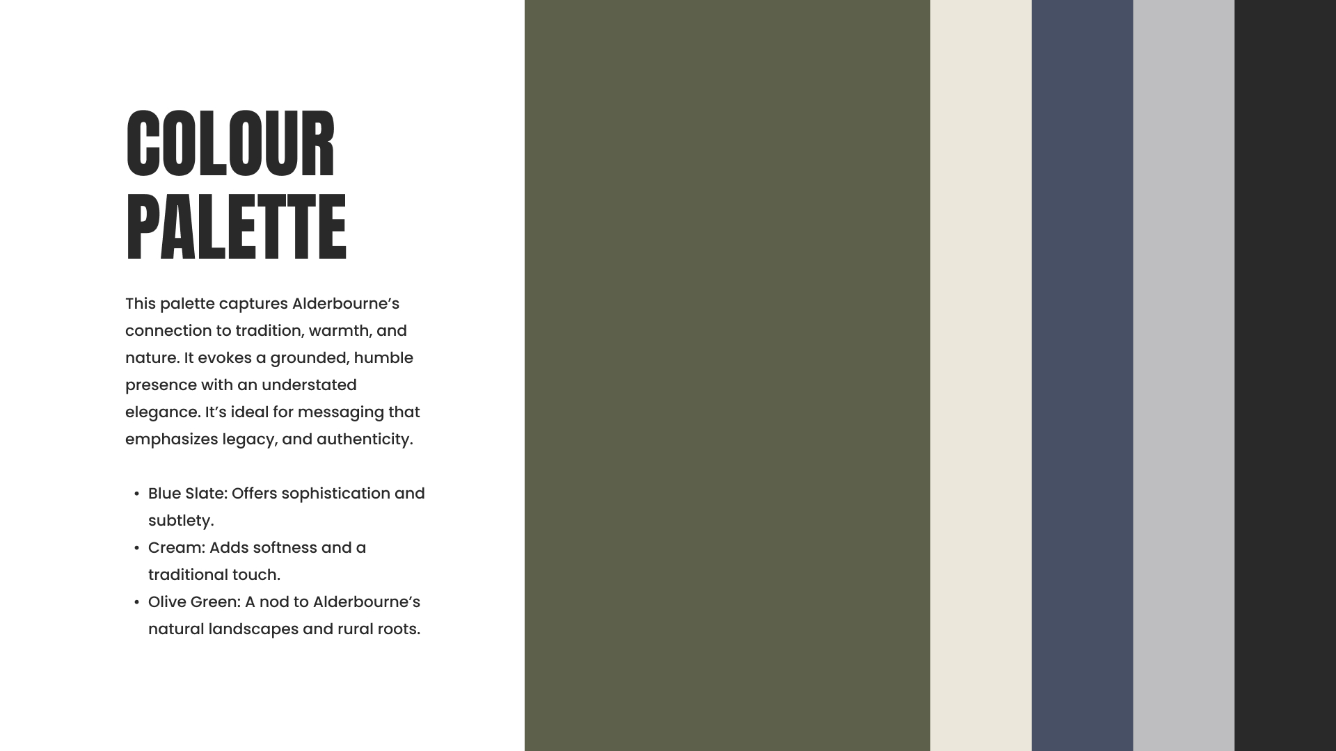
Keywords Classic, Understated, Professional, Clean
The Alderbourne Group is a family office that evolved as an offshoot of The Woodbridge Company. Rooted in legacy and tradition, the family wanted their new visual identity to reference Alderbourne, the English town where their history began. The goal was to create a logo and colour story that would embody heritage and modernity, delivering a mark that felt classic, understated, professional, and versatile, yet carried the quiet strength of a powerful brand.
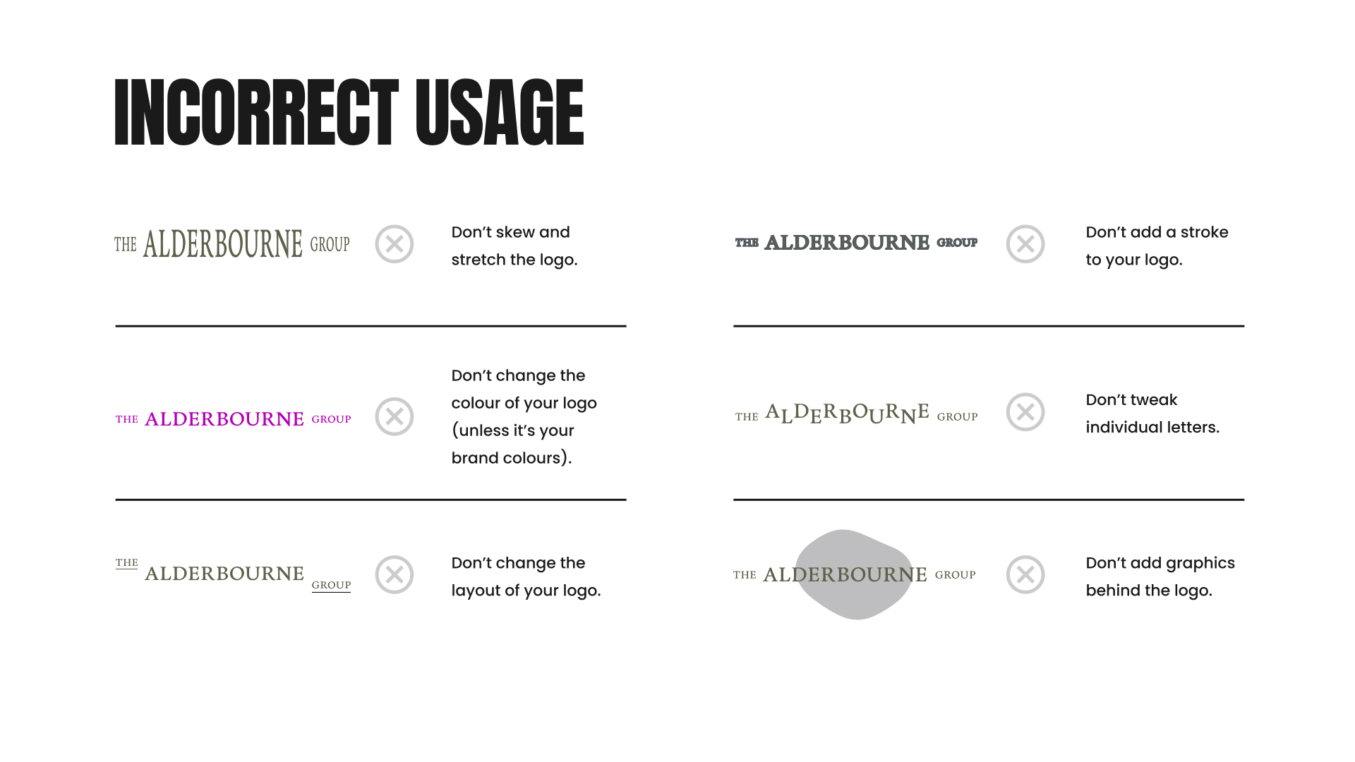
Logo Guidelines
Email design@erinleemcdonald.com
Linkedin @erinleemcdonald
Instagram @erin.leeeeeeee